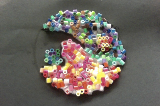
| Thought Process: this is an unfinished yin-yang symbol. Yin-Yang represents polar opposites, like fire and water. The original yin-yang is black and white, but I thought that was boring, so I did warm colors and cool colors. Warm colors are bright and energetic, making you think of the sun. Red, orange, yellow, and pink are all examples of warm colors. Cool colors are peaceful and cool. It makes you think of a light summer breeze. Blue, green, purple and in some cases neon, are all cool colors. I thought about the field in Westgate and how it looked in the Summer. Then, I thought of how it looked in the Winter. I thought about how those two scenes are the same place but look so different. I wanted to apply that to my final product, so I chose colors that look completely different. 1. I made this because I always found a certain beauty in yin-yang, seeing polar opposites right next to each other. I always wanted to make that effect, and this was my opportunity. 2. I was creative by instead of doing a black and white yin-yang, I did it in color. Also, I glued perler beads onto the paper instead of using markers or crayons. 3. I loved this activity because it let me express myself through artwork. Doing this helped my creativity flow and also was loads of fun! |
 RSS Feed
